gotrg
Business Intelligence reporting tool
Transforming complex data into simple,
actionable insights
I redesigned the reporting experience to make exploring data intuitive for both operational teams and analysts. By simplifying how reports are built and creating a prototype that demonstrated a clearer interaction model, I helped turn reporting from something teams avoided into a tool they could use with confidence inside the platform.
SaaS
UX Design
Protoyping
Role / Scope:
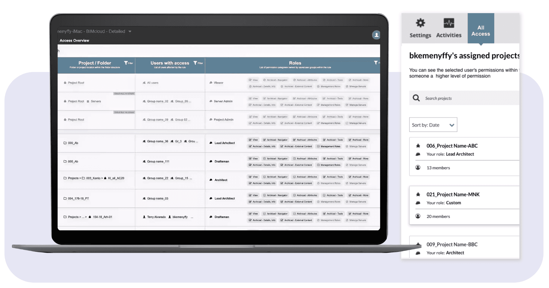
Product Designer responsible for redesigning the Reporting and Visualization module of R1 Cloud, goTRG’s enterprise returns-management and supply-chain platform.
Worked closely with the UX researcher, product manager, and engineering leads totranslate complex data requirements into
intuitive, flexible reporting tools that empower users to build and interpret dashboards without relying on exports to Excel or Tableau.
Timeframe
2019–2020~4 months
Constraints
Legacy dependency: Users heavily relied on exporting millions of rows to Excel for analysis; rebuilding trust in the in-platform tool was essential.
Data-heavy environment: Needed to display high-volume data dynamically while maintaining responsiveness and clarity.
Time and scope pressure: Tight quarterly delivery with ongoing backend restructuring limited experimentation.
User variance: Expert analysts vs. everyday managers had different expectations for detail, filters, and visual density.
Key decisions
1.
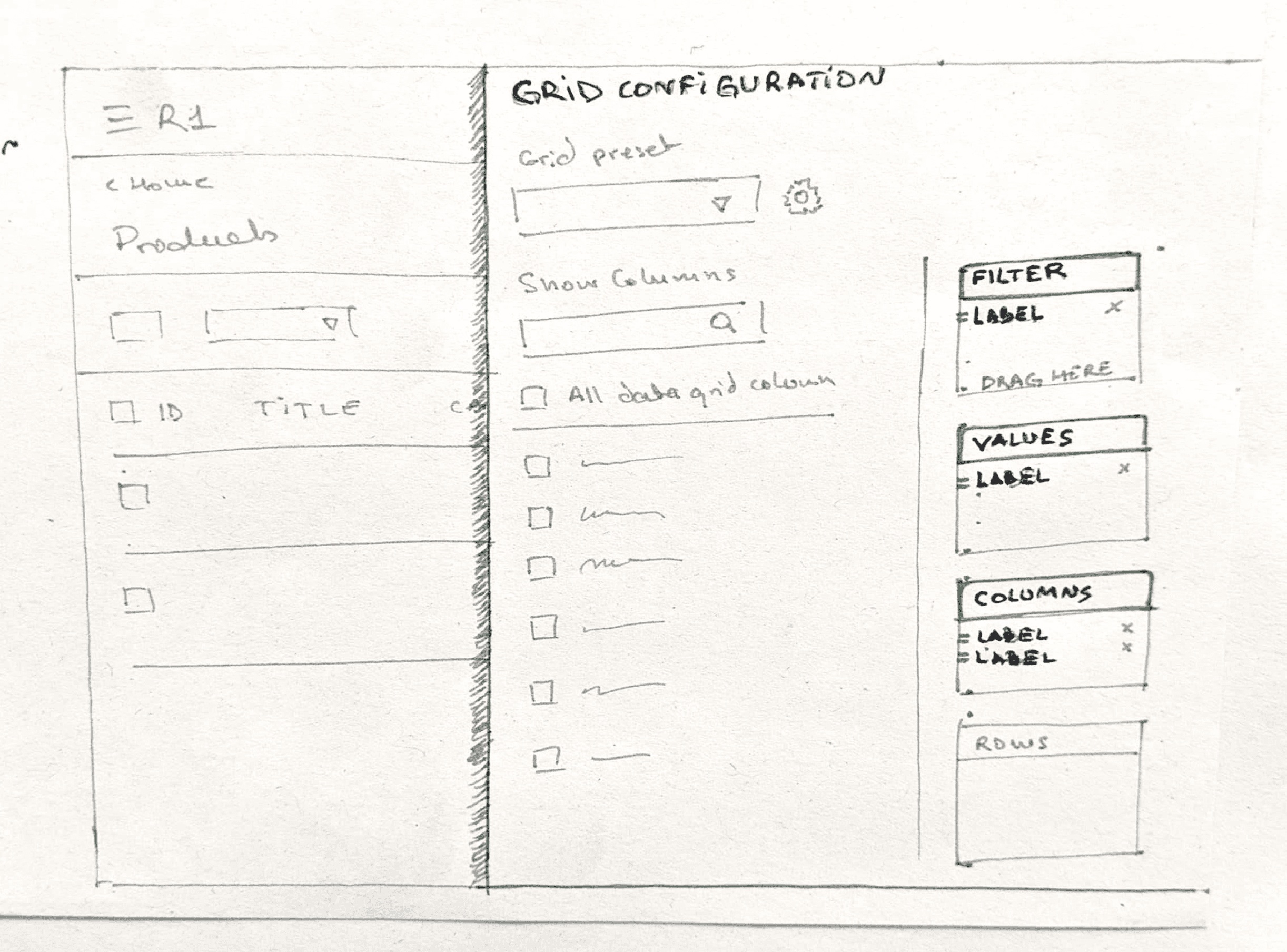
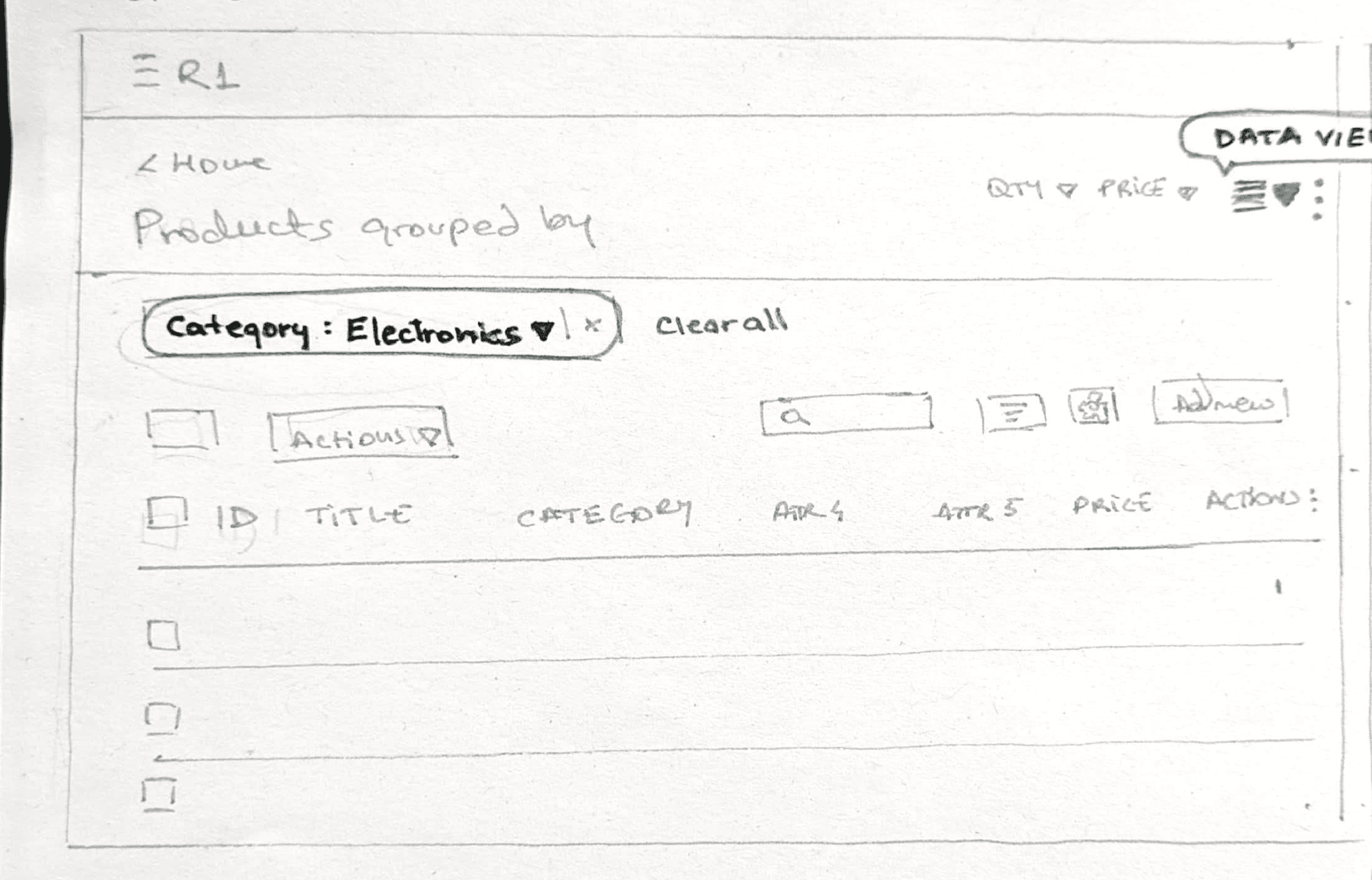
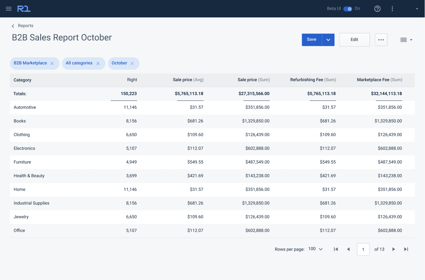
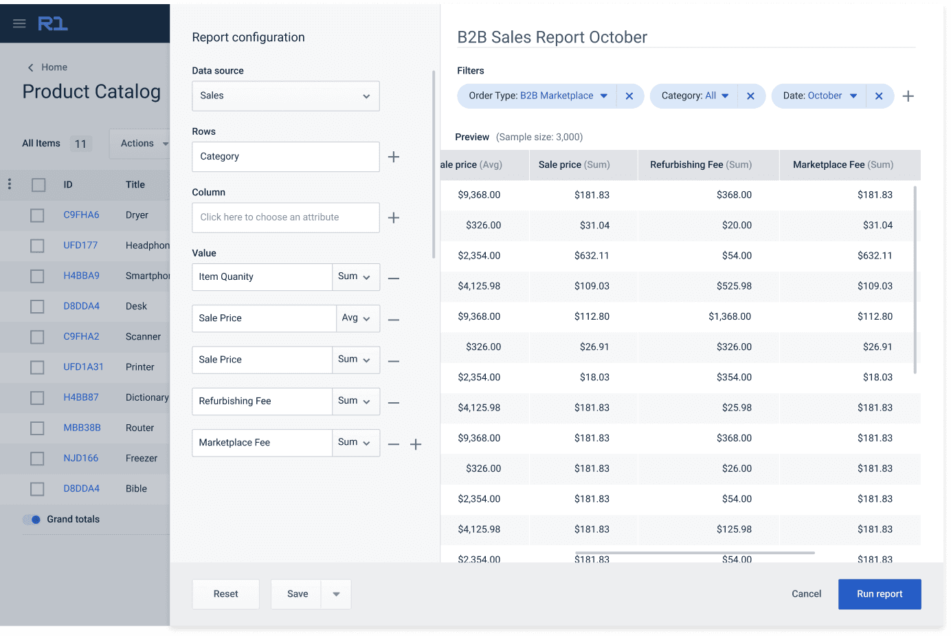
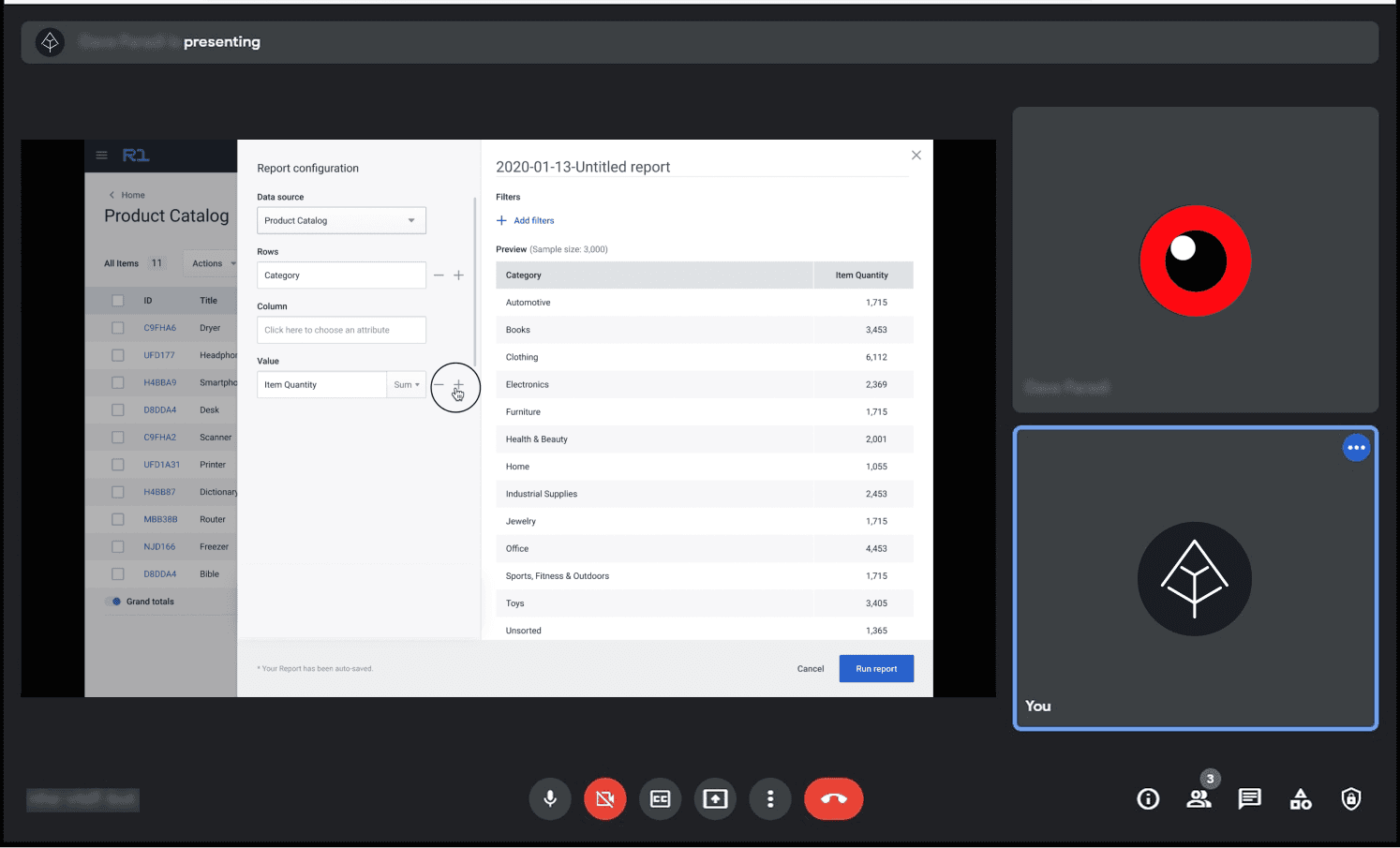
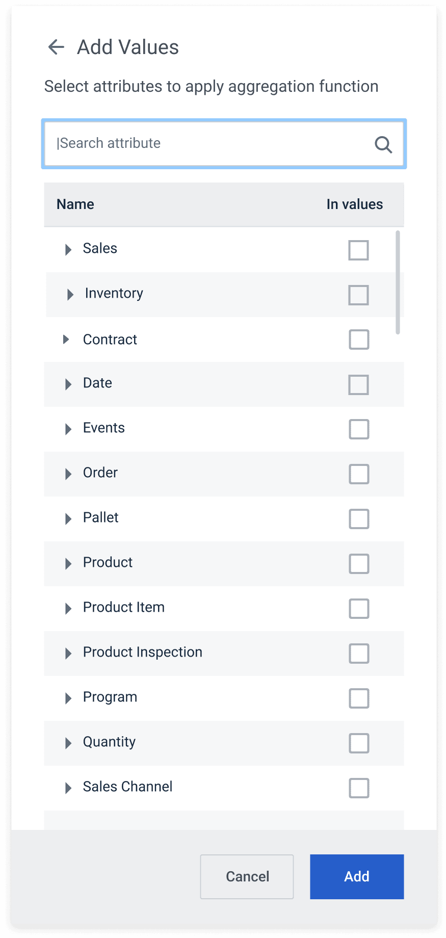
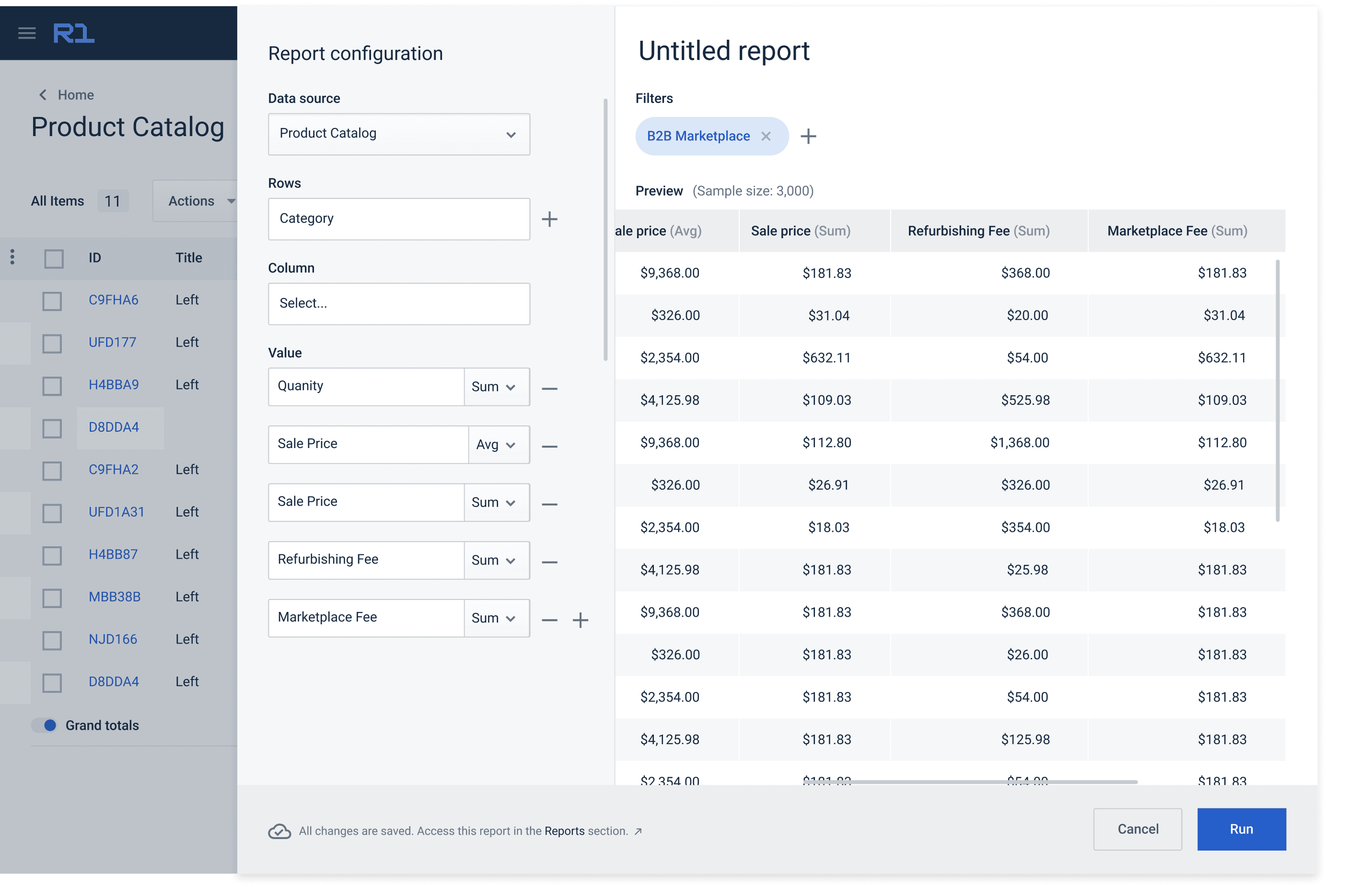
Redefined the reporting experience by transitioning from static tables to an interactive grid constructor that allowed users to select subject areas, values, and columns directly from live database fields.
Advanced configuration
Hybrid view
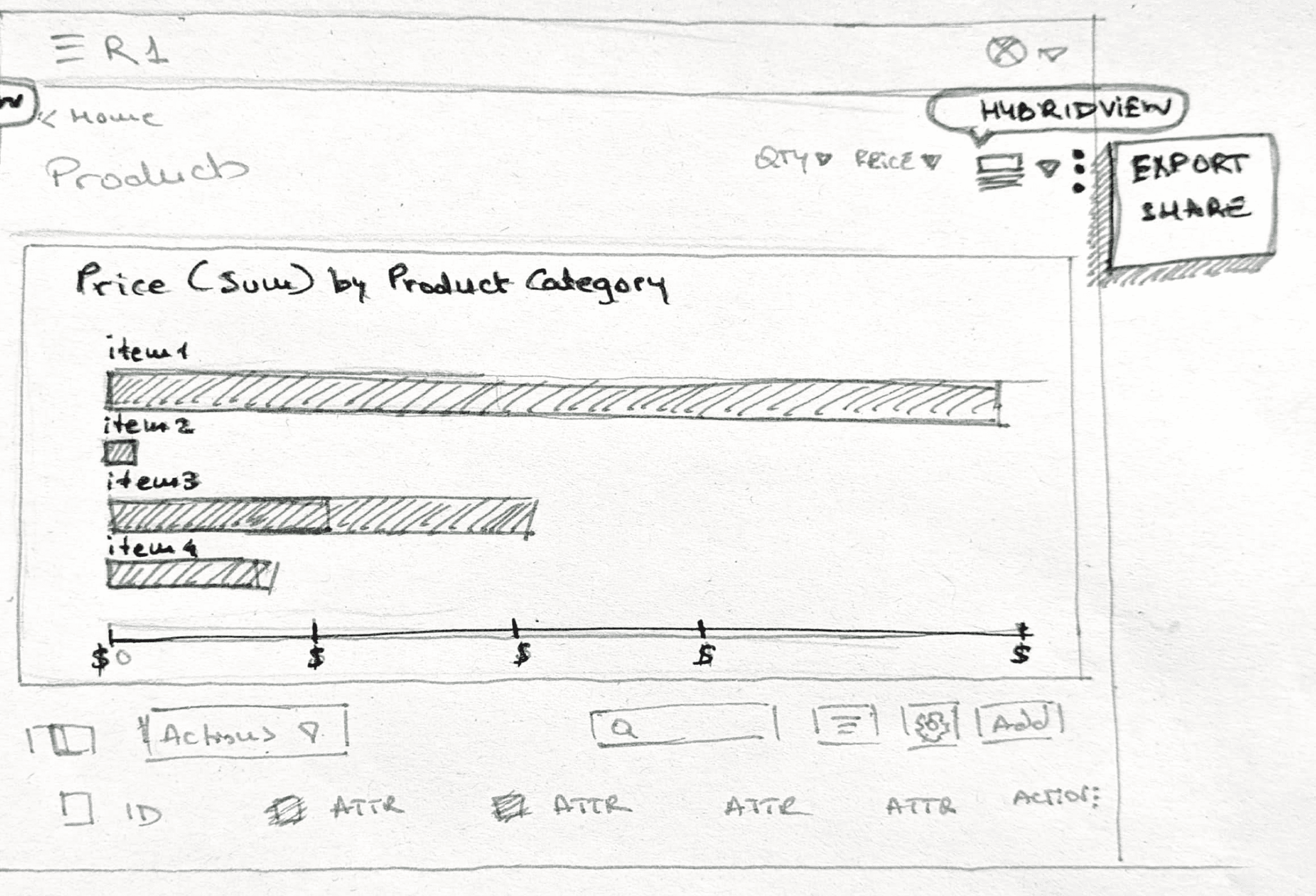
Table view grouped
2.
Simplified filtering and navigation by implementing clear labeling, progressive disclosure, and responsive pagination to prevent information overload.
3.
Advocated user-centric reporting logic to ensure consistent order of operations (values, filters, columns), mirroring natural analytical reasoning rather than database syntax.
4.
Facilitated alignment across business and engineering by hosting walkthroughs explaining visualization logic and component behavior, building shared understanding under tight timelines.
Results
Significant reduction in data processing time and user frustration
Unified and intuitive data visualization providing clearer insights
Reduced manual data manipulation, leading to fewer errors and improved accuracy
Impact
Transformed goTRG’s BI experience from a static export utility into an interactive decision-support tool, empowering retail and supply-chain clients (including Walmart, Target, and Home Depot) to analyze performance in real time. The redesign demonstrated how thoughtful UX and data visualization can turn complexity into clarity, even in enterprise environments bound by technical and time constraints.
gotrg
Business Intelligence
reporting tool
Transforming complex data into simple, actionable insights
I redesigned the reporting experience to make exploring data intuitive for both operational teams and analysts. By simplifying how reports are built and creating a prototype that demonstrated a clearer interaction model, I helped turn reporting from something teams avoided into a tool they could use with confidence inside the platform.
SaaS
UX Design
Protoyping
Role / Scope:
Product Designer responsible for redesigning the Reporting and Visualization module of R1 Cloud, goTRG’s enterprise returns-management and supply-chain platform.
Worked closely with the UX researcher, product manager, and engineering leads totranslate complex data requirements into
intuitive, flexible reporting tools that empower users to build and interpret dashboards without relying on exports to Excel or Tableau.
Timeframe
2019–2020~4 months
Constraints
User variance: Expert analysts vs. everyday managers had different expectations for detail, filters, and visual density.
Legacy dependency: Users heavily relied on exporting millions of rows to Excel for analysis; rebuilding trust in the in-platform tool was essential.
Data-heavy environment: Needed to display high-volume data dynamically while maintaining responsiveness and clarity.
Time and scope pressure: Tight quarterly delivery with ongoing backend restructuring limited experimentation.
Key decisions
1.
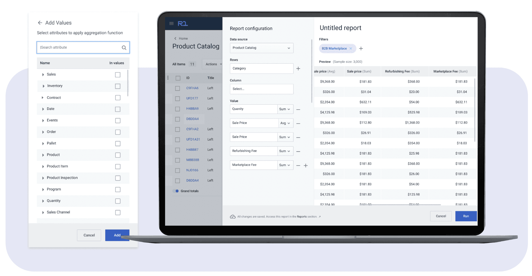
Redefined the reporting experience by transitioning from static tables to an interactive grid constructor that allowed users to select subject areas, values, and columns directly from live database fields.
Advanced configuration
Table view grouped
Hybrid view
2.
Simplified filtering and navigation by implementing clear labeling, progressive disclosure, and responsive pagination to prevent information overload.
3.
Advocated user-centric reporting logic to ensure consistent order of operations (values, filters, columns), mirroring natural analytical reasoning rather than database syntax.
4.
Facilitated alignment across business and engineering by hosting walkthroughs explaining visualization logic and component behavior, building shared understanding under tight timelines.
Results
Significant reduction in data processing time and user frustration
Unified and intuitive data visualization providing clearer insights
Reduced manual data manipulation, leading to fewer errors and improved accuracy
Impact